
Contractors don’t read your “About” page, they scroll to your before and after photos.
Let’s talk about what a contractor does when someone says “we’re thinking of hiring this designer.” They might be standing in a half-demoed kitchen when they pull out their phone to Google you. They don’t have time to read your About page and creative inspiration. They have maybe thirty seconds and one question.
Can this designer actually deliver?
I spent 18 years as a creative director in advertising, and I can tell you the thing nobody wants to hear: your website is not for you. It’s not even primarily for your homeowner clients (not first, anyway). If builders and contractors are how you get work, your site has one job, and that job is to prove you know what you’re doing.
So. How do you do that?
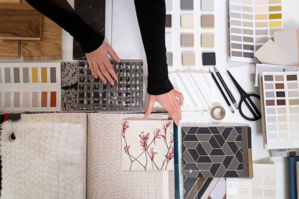
Contractors are doing the math in their head.
Here’s what’s running through a contractor or builder’s brain while they scroll. Are these drawings going to be buildable? Will the budget be accurate? Will this designer answer my texts? Will I be fixing her ideas on a Friday afternoon with a crew standing around?
That’s risk. Builders are sizing up risk, not admiring your taste in hardware finishes.
The fastest way to answer all of their questions, without making anyone read a single paragraph, is a really good before-and-after section of photos.
Here’s how to make an effective interior design before-and-after section.
- Show the transformation A gorgeous finished room is good. A gorgeous finished room next to the sad, dated, badly lit space it started as is convincing. The “before” is what makes the “after” believable. (It takes guts to post the ugly beige before. Do it anyway.)
- Match the angle. Same spot, same lighting/dime of day, if you can swing it. Pro tip: have the client snap their “before” photos from taped X’s on the floor before demo starts.
- Caption it like a builder would read it. Contractors want to know what happened. Give them one line each: “Full kitchen remodel. Wall removed between kitchen and dining. 14 weeks. $85-95K.” Done. This is more useful than three paragraphs about the aesthetics.
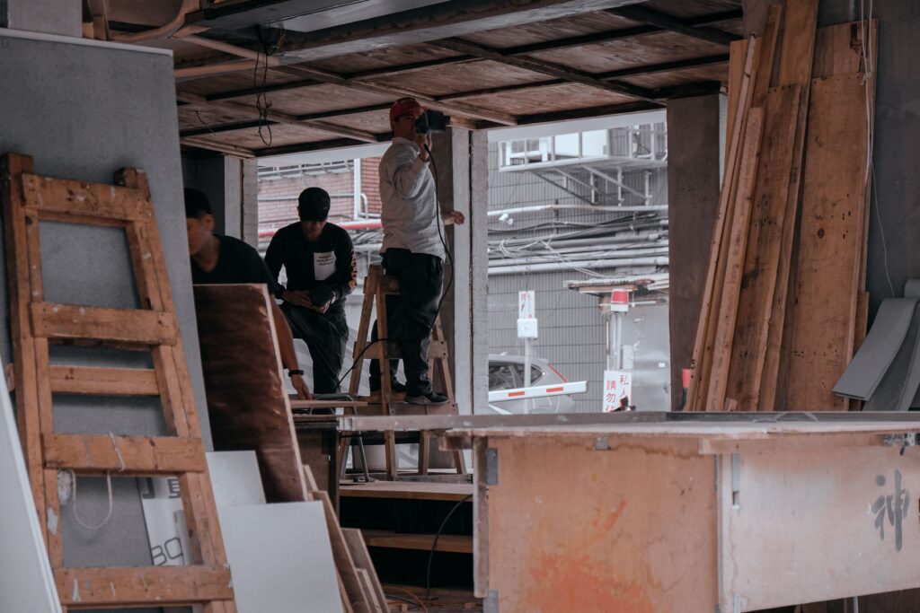
- Include shots of in-progress work. I know, it’s hard to post a messy looking photo. But one demo shot or a mid-build pic shows that “this person has been on an actual job site,” and it can earn more trust than a page of perfect shots of completed rooms.
- Lead with your best. Six to eight projects at the top. Not twenty. I know, I know, you love them all but please put your showstoppers up front and tuck the rest behind a “see more” button.
- Provide Image Categories. Contractors usually arrive with a specific job in mind. Kitchen remodel. Primary suite addition. A restaurant buildout. Give them simple filters by project type, and if you can, include the scope: cosmetic refresh vs. structural changes. Scope matters. A builder who sees you’ve handled load-bearing walls and permit-heavy projects will relax a little. A builder who only sees paint and pillows will wonder.
- Make the thumbnail do the work. Each project gets one image that signals the transformation before anyone clicks. The one that makes you think “wait, that used to be a closet?” Curiosity makes visitors read further.
- Keep the project pages consistent. Same layout every time: When every project follows the same pattern, visitors learn the system after the first one and can skim the rest at speed. When every page is unique, they have to start from scratch each time, and they won’t.
- Name the people involved. If you worked with a builder you love, say so. “Built by [contractor name]” with a link to their site does three jobs at once: it credits a collaborator, it’s a quiet endorsement of how you work with builders, and it’s the kind of thing that gets you referred right back.
Quick Takeaway: If a contractor can land on your homepage and reach a useful before-and-after in two clicks or fewer, you’re in good shape. If it takes more than that, that’s the first thing to fix.
Build trust beyond the photos.
Photos prove you can make a pretty room but they don’t prove you’re easy to work with. For that, you need other people saying so, ideally other contractors and builders (as well homeowners).
Get testimonials from contractors, not just homeowners. Homeowner reviews say “she has such good taste!” and that’s breat, but a builder reading it just shrugs. A line from another contractor hits different: “Her drawings were clear, she answered questions same-day, and the install went smoothly.” That sentence is worth more to a builder than a whole page of your design philosophy.
If you’ve got a few contractor quotes, put them right next to your portfolio, not on a lonely “Testimonials” page nobody visits.
Write a short “How I work with builders” section.
This is something almost nobody does, which is exactly why it works. A few honest paragraphs: how you share drawings and specs, how fast you respond, how you handle change orders, whether you do site visits and how often. You’re answering their questions, before they have to ask. It also quietly filters out the clients who won’t be a fit, which saves you time.
To win builder clients as an interior designer, focus on proving that you save them time, reduce expensive mistakes, and keep projects on schedule. Builders value efficiency and clear communication far more than aesthetic theory.
How to Position Your Value to Builders
- Speak Their Language: Talk about your ability to produce clean, build-ready documentation, like detailed elevations, plumbing & electrical rough-in specs, and comprehensive finish schedules.
- Emphasize Timeline Protection: Explain how you help homeowners make finish selections early. Eliminating late material decisions prevents delays and frustrating change orders for the contractor.
- Act as a Client Buffer: Builders often struggle with indecisive clients. Show how you manage client expectations, translate design concepts, and handle selection stress so the builder can focus on construction.
- Show your credentials, but keep them in their lane. Licenses, certifications, professional memberships, press mentions. Put them together near the footer or on your About page. They matter, but they’re supporting actors, not the stars.
Make the Next Step Easy
You’ve got a builder interested. They’ve seen your work, they like it. Now what? If the answer is “hunt around for a contact page,” you just lost them.
Give builders their own page. A “Partner with me” or “Work with builders” button, in the header, separate from the homeowner inquiry. It tells contractors this site was built with them in mind, and it lets you route those conversations differently.
Keep the form short. Name, email, phone, project type, location, timeline, and what stage the build is in. Every extra field is a reason to bail, and “stage of the build” tells you right away whether it’s a “let’s talk next month” or a “we pour concrete on Thursday” situation.
Say what happens next. This one is so simple but often skipped. Say right under the button: “I’ll reply within one business day to set up a quick call.” People relax when they know what to expect. And then, obviously, actually do it.
Repeat the button. Top of the page, bottom of the page, and at the end of each project. If someone finishes a before-and-after and thinks “yes, I want that,” the button should already be there waiting.
The Un-Sexy Stuff (but this is important)
Here’s the less-fun truth: all those gorgeous, high-res photos can make a site painfully slow. And a slow site can quickly lead your visitors to close the tab. Here are a couple of tips:
- Compress your images. Big files are the number one reason portfolio sites can be slow. Your web designer (hi, that’s me) can handle this, but if you’re managing the site yourself, run photos through a compression tool before uploading. They’ll look basically identical and load in a fraction of the time.
- Name your images. Also be sure to name the photo files for web crawlers to find (this will help your SEO) and give them thoughtful alt text (Google will consider your site more reputable with this)
- Test it on your phone. With your thumb. Can you swipe through photos easily? Can you tap the filters? Can you find the contact button without pinching and zooming? Most builders will see your site on a phone, so the mobile version is really important.
++++++++++++++++++++++++++++++++++++++++++++++++++++++++++++++++++++++++
Quick check: how does your site stack up?
Pull up your homepage and answer these honestly:
- Can a visitor reach a before-and-after within two clicks?
- Does every project show scope, timeline, and a budget range?
- Are there any process or mid-build photos, not just the polished finish?
- Is there at least one testimonial from a contractor or builder?
- Can a builder find a “work with me” button without scrolling or searching?
- Does the site load in a few seconds on your phone?
- Does your contact form tell people what happens next?
If you got five or more yeses, you’re in good shape. If you got fewer than that, you’ve just made yourself a to-do list.
TLDR (the short version)
Builders and contractors are not browsing. They’re vetting. They want proof, clarity, and an easy way to reach you, and they want it on a phone, in about thirty seconds.
Show the transformation. Make it easy to scan. Back it up with real voices. Give them a clear next step.
And if you read this and thought “I know I need to fix this, I just don’t have the time,” well. That’s literally what I do. I’m happy to take a look at your site and give you a few honest, specific suggestions, no pressure and no jargon.